- Published on
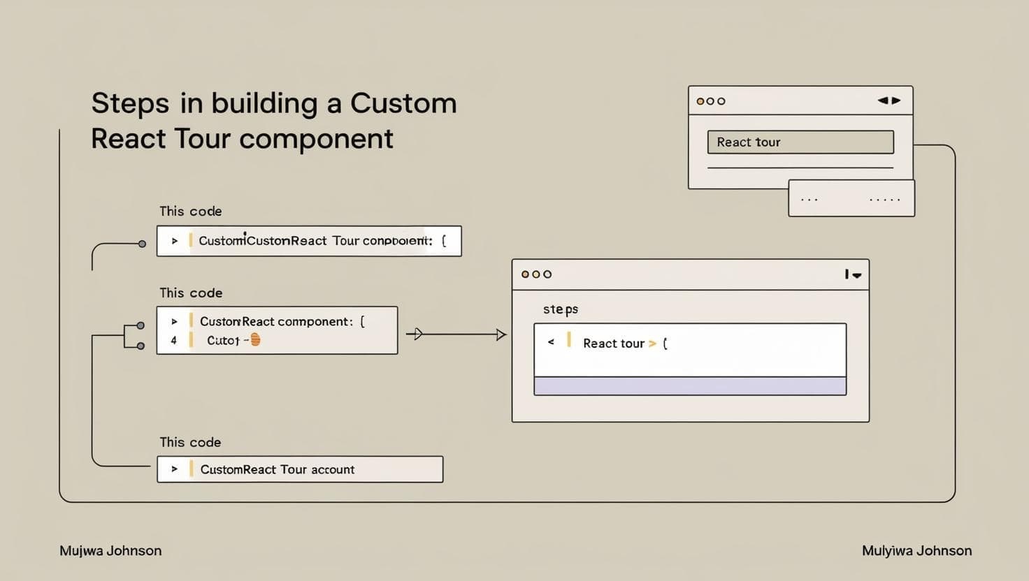
How to Build a Custom React Tour Component
- Authors

- Name
- Muyiwa Johnson
How to Build a Custom React Tour Component
Hi there! If you're like me, you love building things from scratch. Today, I'm going to show you how to create a custom React tour component using hooks and TypeScript. This is a lighter alternative to existing libraries like React Joyride, and it gives you the flexibility to customize it according to your needs.
Table of Contents
- Introduction
- Project Overview
- Tour Guide Mechanics
- User Experience Design
- Advanced Considerations
- Conclusion
Introduction
Purpose of In-App Tours
When users open your app for the first time, they're often hit with a mix of curiosity and confusion. I remember building an early version of a web app for one of my clients and watching a tester just stare at the screen, not sure where to start. That moment stuck with me.
In-app tours exist to change that — to greet your users like a helpful guide, not a wall of features. A well-crafted tour turns overwhelm into confidence. It gives users direction, highlights what matters, and builds trust from the very first click.
Benefits of User Onboarding
When done right, interactive tours do more than just introduce features — they guide users to value, faster. Some key benefits include:
- Faster user activation – Help users hit the ground running from day one
- Better feature discovery – Gently surface the tools they didn't know they needed
- Stronger user retention – When people understand your product, they stick around
- Lower support burden – Fewer "how do I…" messages in your inbox
Project Overview
Technologies Used
Our custom tour guide system is built using the following technologies:
- React: Handles component structure, state management, and rendering logic
- TypeScript: Ensures type safety and improves developer experience through better tooling and early error detection
- Tailwind CSS: Provides utility-first styling for rapid and consistent UI development
- Radix UI: Supplies accessible, unstyled primitives used for interactive elements like popovers and focus management
- React Portal: Enables rendering of tour overlays and tooltips outside the normal DOM hierarchy, ensuring correct z-index layering and layout isolation
Project Installation
Follow these steps to set up the project:
- Clone the Repository:
git clone https://github.com/codewithjohnson/build-your-own-tour-guide.git
- Navigate to the Project Directory:
cd build-your-own-tour-guide
- Install Dependencies:
npm install
- Start the Development Server:
npm run dev
Core Components
The tour guide consists of three primary components:
- Spotlight Mechanism: Highlights target elements
- Tooltip Renderer: Displays contextual information
- Navigation Controller: Manages tour progression
Let's take a look at the main components of the tour guide:
// src/components/TourGuide.tsx
import { useState, useEffect, useRef } from 'react'
import { Portal } from '@radix-ui/react-portal'
import { Button } from '@/components/ui/button'
import { Progress } from '@/components/ui/progress'
import { cn } from '@/lib/utils'

export type TourStep = {
  target: string
  title: string
  content: string
  position?: 'top' | 'right' | 'bottom' | 'left'
}

interface TourGuideProps {
  steps: TourStep[]
  isOpen: boolean
  onClose: () => void
  onFinish: () => void
}

export function TourGuide({ steps, isOpen, onClose, onFinish }: TourGuideProps) {
  const [currentStep, setCurrentStep] = useState(0)
  const [tooltipStyle, setTooltipStyle] = useState({})
  const [highlightStyle, setHighlightStyle] = useState({})
  const [animation, setAnimation] = useState('')
  const tooltipRef = useRef<HTMLDivElement>(null)

  // Calculate the position of the tooltip relative to the target element
  const calculatePosition = () => {
    if (!isOpen || steps.length === 0) return

    const targetElement = document.querySelector(steps[currentStep].target)
    if (!targetElement) return

    const targetRect = targetElement.getBoundingClientRect()
    const position = steps[currentStep].position || 'bottom'

    // Set highlight position (the spotlight effect)
    setHighlightStyle({
      top: `${targetRect.top}px`,
      left: `${targetRect.left}px`,
      width: `${targetRect.width}px`,
      height: `${targetRect.height}px`,
    })

    // Set tooltip position
    const tooltipWidth = 300 // Fixed width for tooltip
    const tooltipHeight = tooltipRef.current?.getBoundingClientRect().height || 150
    const spacing = 12 // Space between target and tooltip

    let top = 0
    let left = 0

    switch (position) {
      case 'top':
        top = targetRect.top - tooltipHeight - spacing
        left = targetRect.left + targetRect.width / 2 - tooltipWidth / 2
        break
      case 'bottom':
        top = targetRect.bottom + spacing
        left = targetRect.left + targetRect.width / 2 - tooltipWidth / 2
        break
      case 'left':
        top = targetRect.top + targetRect.height / 2 - tooltipHeight / 2
        left = targetRect.left - tooltipWidth - spacing
        break
      case 'right':
        top = targetRect.top + targetRect.height / 2 - tooltipHeight / 2
        left = targetRect.right + spacing
        break
    }

    // Ensure tooltip stays within viewport
    const viewportWidth = window.innerWidth
    const viewportHeight = window.innerHeight

    if (left < 10) left = 10
    if (left + tooltipWidth > viewportWidth - 10) left = viewportWidth - tooltipWidth - 10
    if (top < 10) top = 10
    if (top + tooltipHeight > viewportHeight - 10) top = viewportHeight - tooltipHeight - 10

    setTooltipStyle({
      top: `${top}px`,
      left: `${left}px`,
      width: `${tooltipWidth}px`,
    })

    // Set animation
    setAnimation('animate-fade-in')
  }

  // Calculate position on step change or window resize
  useEffect(() => {
    calculatePosition()
    window.addEventListener('resize', calculatePosition)

    return () => {
      window.removeEventListener('resize', calculatePosition)
    }
  }, [currentStep, isOpen])

  // Handle next step
  const handleNext = () => {
    if (currentStep < steps.length - 1) {
      setAnimation('animate-fade-out')
      setTimeout(() => {
        setCurrentStep(currentStep + 1)
        setAnimation('animate-fade-in')
      }, 200)
    } else {
      handleFinish()
    }
  }

  // Handle previous step
  const handlePrevious = () => {
    if (currentStep > 0) {
      setAnimation('animate-fade-out')
      setTimeout(() => {
        setCurrentStep(currentStep - 1)
        setAnimation('animate-fade-in')
      }, 200)
    }
  }

  // Handle finish or skip
  const handleFinish = () => {
    setCurrentStep(0)
    onFinish()
  }

  if (!isOpen || steps.length === 0) return null

  const progress = ((currentStep + 1) / steps.length) * 100

  return (
    <Portal>
      {/* Overlay with spotlight effect */}
      <div
        className="fixed inset-0 z-50 bg-black/50 transition-opacity duration-300"
        onClick={onClose}
      >
        {/* Spotlight (transparent hole) */}
        <div
          className="border-primary absolute z-10 box-content rounded-md border-2 transition-all duration-300"
          style={highlightStyle}
        />
      </div>

      {/* Tooltip */}
      <div
        ref={tooltipRef}
        className={cn('fixed z-[60] rounded-lg bg-white p-4 shadow-lg', animation)}
        style={tooltipStyle}
      >
        <div className="mb-1 flex items-center justify-between">
          <h3 className="text-lg font-bold">{steps[currentStep].title}</h3>
          <Button variant="ghost" size="sm" className="h-8 w-8 rounded-full p-0" onClick={onClose}>
            ✕
          </Button>
        </div>

        <div className="mb-4">
          <p className="text-muted-foreground">{steps[currentStep].content}</p>
        </div>

        <div className="space-y-4">
          <Progress value={progress} className="h-1" />

          <div className="flex items-center justify-between">
            <div className="space-x-2">
              <Button
                variant="outline"
                size="sm"
                onClick={handlePrevious}
                disabled={currentStep === 0}
              >
                Previous
              </Button>
              <Button variant="default" size="sm" onClick={handleNext}>
                {currentStep < steps.length - 1 ? 'Next' : 'Finish'}
              </Button>
            </div>

            <div className="text-muted-foreground text-sm">
              {currentStep + 1} of {steps.length}
            </div>
          </div>
        </div>
      </div>
    </Portal>
  )
}
This component is the heart of our tour guide system. I use a combination of hooks to manage state, calculate positions, and handle animations. The calculatePosition function is particularly important as it determines where the tooltip and spotlight should appear based on the current step.
The useEffect hook listens for changes in the current step and window size, ensuring that the tooltip and spotlight are always correctly positioned.
Next is the index page
// src/pages/index.tsx

import { useState } from "react";
import { Button } from "@/components/ui/button";
import { AppLayout } from "@/components/AppLayout";
import { TourGuide, TourStep } from "@/components/TourGuide";

const Index = () => {
  const [isTourOpen, setIsTourOpen] = useState(false);

  // Define tour steps
  const tourSteps: TourStep[] = [
    {
      target: "#header",
      title: "Welcome to TourGuide",
      content: "This is a demonstration of an in-app guided tour. Let's explore the interface together!",
      position: "bottom"
    },
    {
      target: "#create-tour",
      title: "Create New Tours",
      content: "Click here to create a new tour for your application. You can customize each step and target specific elements.",
      position: "bottom"
    },
   ... other steps

  ];

  const startTour = () => {
    setIsTourOpen(true);
  };

  const endTour = () => {
    setIsTourOpen(false);
  };

  return (
    <div className="min-h-screen flex flex-col">
      <div className="fixed top-4 right-4 z-40">
        <Button onClick={startTour} className="shadow-lg">
          Start Tour
        </Button>
      </div>

      <AppLayout />

      <TourGuide
        steps={tourSteps}
        isOpen={isTourOpen}
        onClose={endTour}
        onFinish={endTour}
      />
    </div>
  );
};

export default Index;
Tour Guide Mechanics
Spotlight Effect
The spotlight effect is achieved by creating a div that overlays the entire screen, with a transparent hole cut out where the target element is located. This gives users a clear focus on the feature being highlighted.
// Spotlight styles
<div className="fixed inset-0 z-50 bg-black/50">
  <div className="border-primary absolute border-2" style={highlightStyle} />
</div>
Dynamic Tooltip Positioning
The tooltip's position is calculated based on the target element's position and the specified direction (top, right, bottom, left). This ensures that the tooltip is always visible and does not overflow the viewport.
const calculatePosition = (targetRect: DOMRect, position: 'top' | 'right' | 'bottom' | 'left') => {
  const spacing = 12

  switch (position) {
    case 'top':
      return {
        top: targetRect.top - spacing,
        left: targetRect.left + targetRect.width / 2,
      }
    // ... other positions
  }
}
Step Navigation
The navigation between steps is handled by updating the currentStep state. The handleNext and handlePrevious functions manage the transitions, including animations for a smoother user experience.
const handleNext = () => {
  if (currentStep < steps.length - 1) {
    setAnimation('animate-fade-out')
    setTimeout(() => {
      setCurrentStep(currentStep + 1)
      setAnimation('animate-fade-in')
    }, 200)
  } else {
    handleFinish()
  }
}
User Experience Design
Smooth Transitions
To enhance the user experience, I use CSS animations for transitions between steps. This makes the tour feel more fluid and engaging.
@keyframes fade-in {
  from {
    opacity: 0;
  }
  to {
    opacity: 1;
  }
}

.animate-fade-in {
  animation: fade-in 0.3s ease-in-out;
  animation-fill-mode: both;
  transition: all 0.3s cubic-bezier(0.68, -0.55, 0.265, 1.55);
}

@keyframes fade-out {
  from {
    opacity: 1;
  }
  to {
    opacity: 0;
  }
}

.animate-fade-out {
  animation: fade-out 0.3s ease-in-out;
  animation-fill-mode: both;
  transition: all 0.3s cubic-bezier(0.68, -0.55, 0.265, 1.55);
}
Progress Tracking
The progress of the tour is visually represented using a progress bar. This gives users a sense of how far they are in the tour and how many steps are left.
<Progress value={progress} className="h-1" />
Responsive Interactions
The tour guide is designed to be responsive, ensuring that it works well on different screen sizes. The tooltip and spotlight positions are recalculated on window resize events, maintaining a consistent experience.
window.addEventListener('resize', calculatePosition)

return () => {
  window.removeEventListener('resize', calculatePosition)
}
Advanced Considerations
Performance Optimization
I plan to implement lazy loading for the tooltip content and spotlight effect. This will ensure that only the necessary elements are rendered at any given time, improving performance.
Accessibility Features
Accessibility is a key consideration in any UI component. I will ensure that the tour guide is keyboard navigable and screen reader friendly. This includes adding ARIA roles and properties to the tooltip and spotlight elements.
Conclusion
My one cent
- Building a custom tour guide component in React allows for greater flexibility and customization compared to existing libraries.
- Using TypeScript enhances type safety and improves the developer experience. I love TypeScript and I think I'm getting better at it.
- The combination of hooks, CSS animations, and Radix UI primitives provides a solid foundation for creating an engaging user experience.